Viewing entries tagged
Brand

Comment

Making our Hearts Sing

ETS Drinkware-Set.jpg

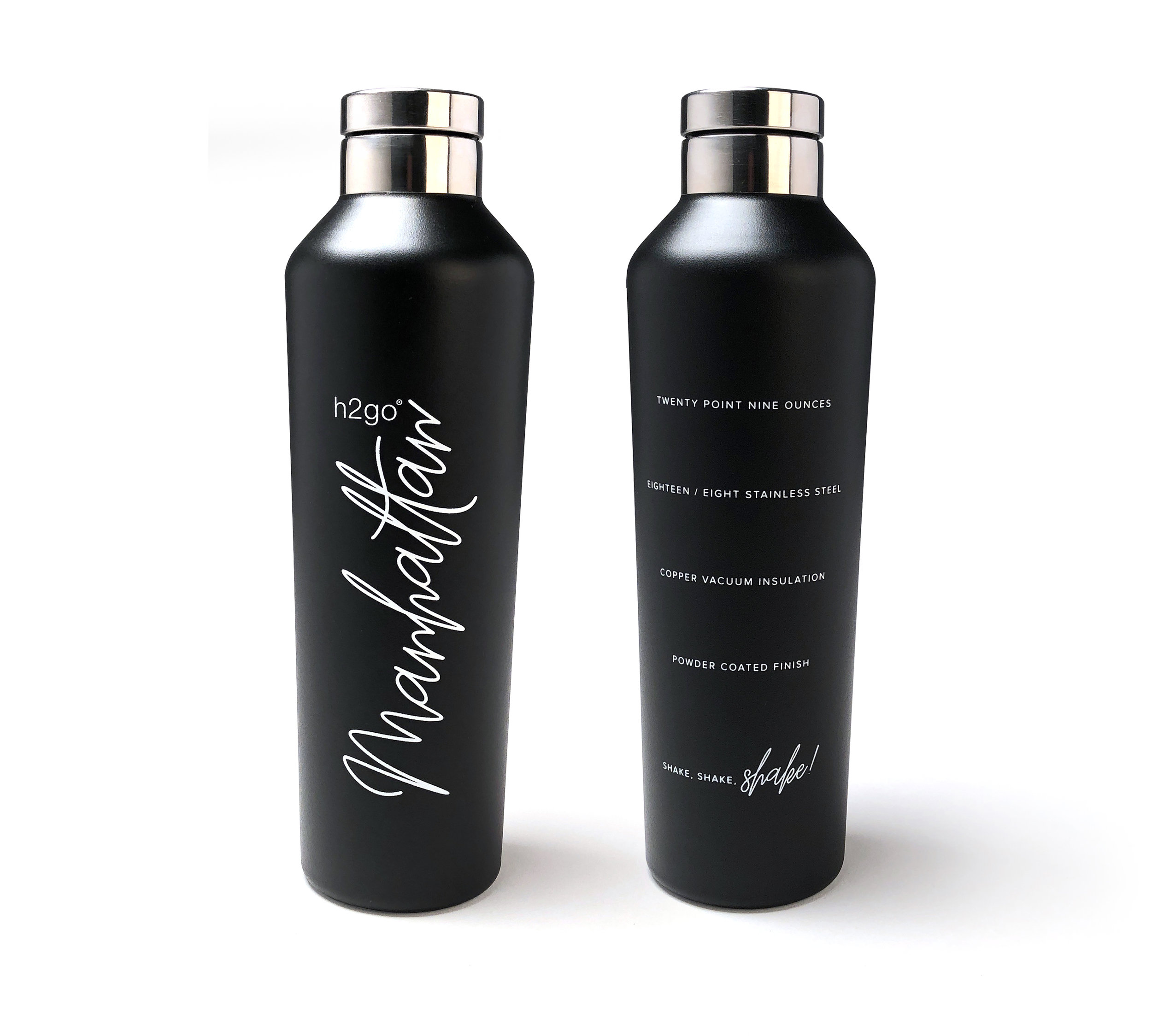
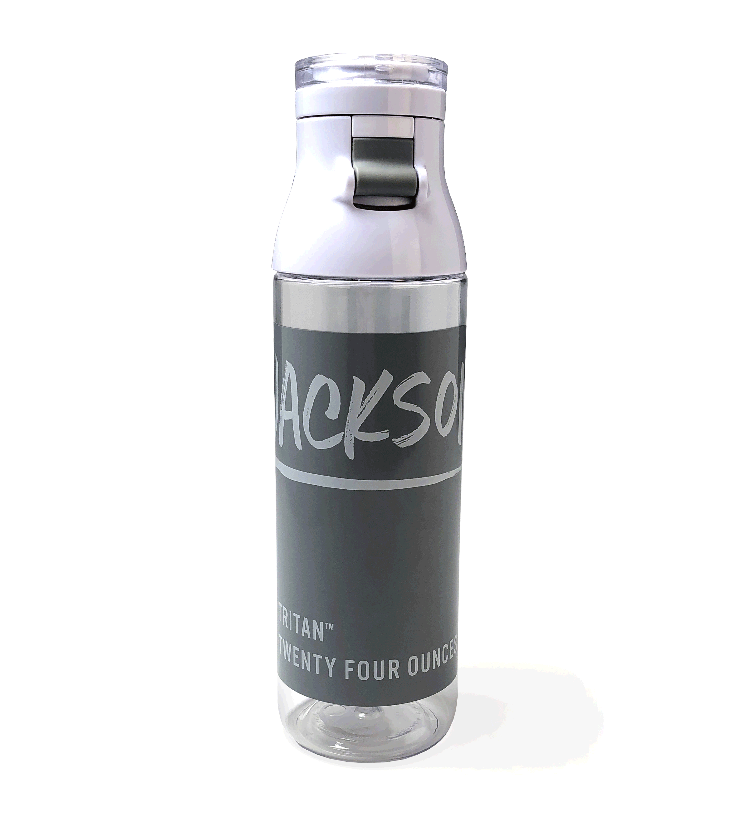
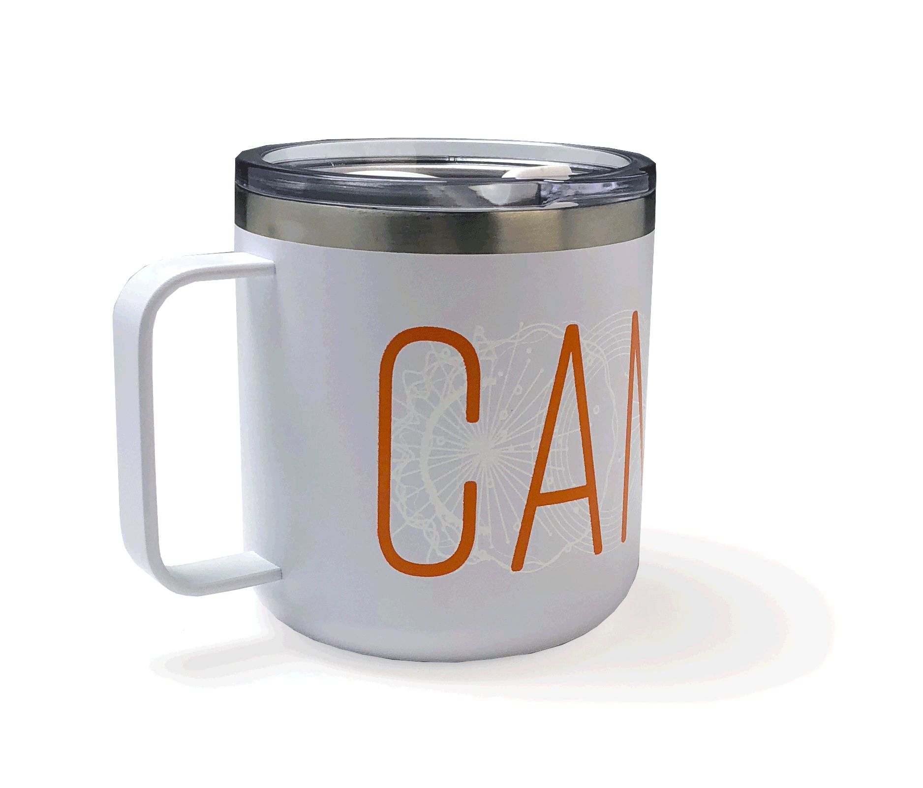
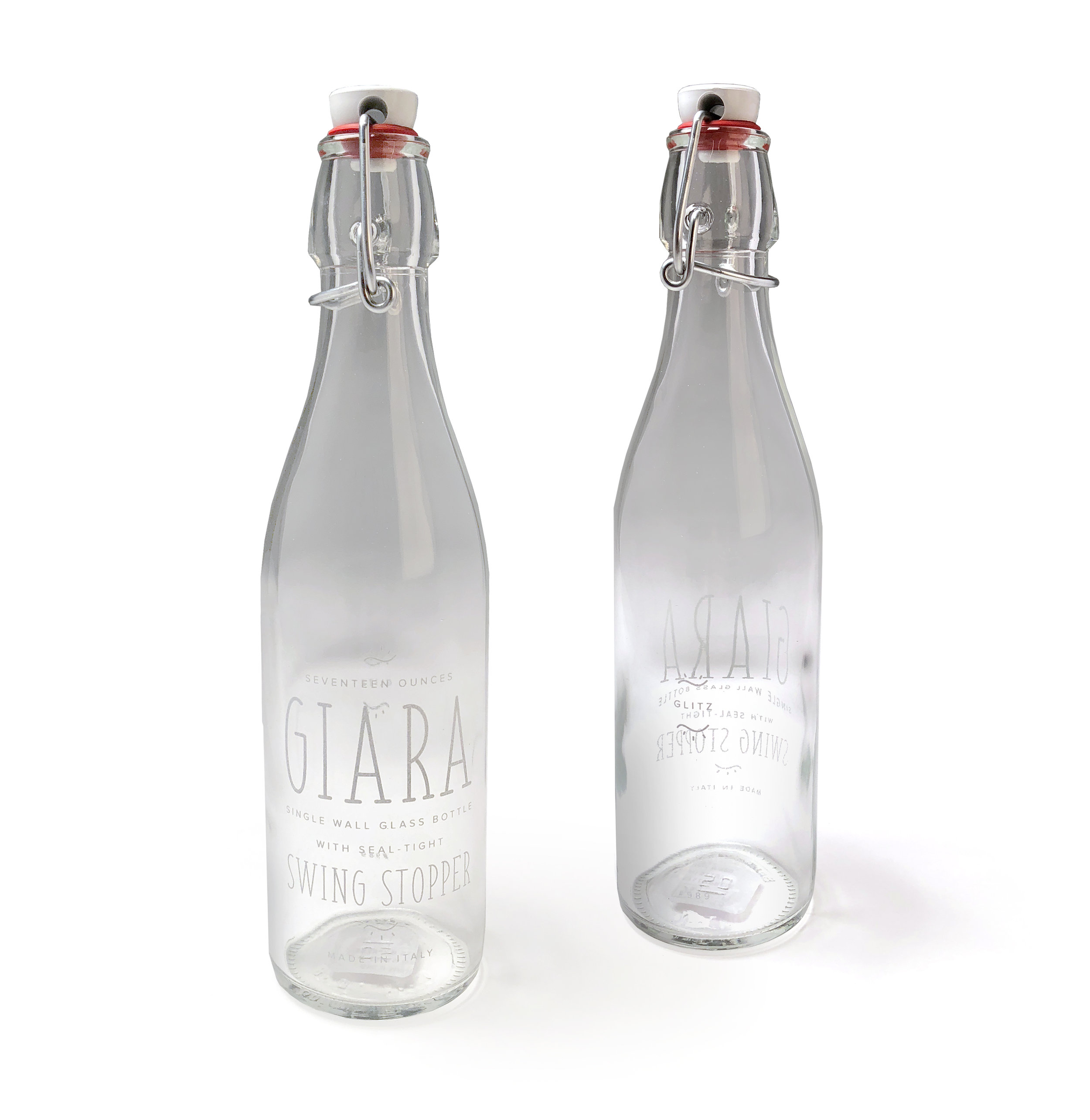
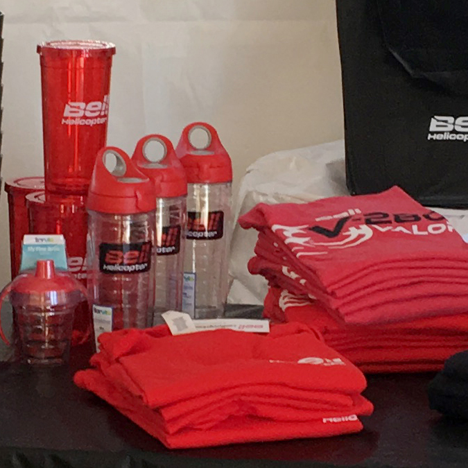
There is no mistaking our immense love for good drinkware. But what we love even more than good drinkware, is good drinkware with great decoration! This standout selection is not only on trend but they also offer impressive decoration options. From large imprint areas to new "mirror print" techniques, it all makes our hearts pitter patter. 

Comment

Comment

That's a Wrap, Texas

We love what we do and it's our joy to provide nothing but the best for our clients. Come rain or shine or freezing cold winds we are ready to take our client's Gift Shops mobile and that's exactly what we did for Bell Helicopter. This past weekend we set up shop at the Bell Helicopter Fort Worth Alliance Air Show and had a blast promoting their brand.

The Alliance Airshow set up was even better than I had envisioned; you really created a special experience for our customers who came by and it was reflected in our sales numbers! You ladies have such an eye for selecting things people have to have and arranging them in such a way that draws you into the store. Thanks for all your hard work – you’ve really raised the bar for our stores and all credit goes to GVD! Also grateful for your cheerful, can-do attitude…even on bone-chilling, windy days! You and your team are a delight to work with.
— Andrea O., HR Promotions & Events Specialist

Comment

Comment

SILENTLY JUDGING YOUR FONT CHOICE

Typography at it's most basic state is the art and technique of arranging type to make written language legible, readable, and appealing when displayed. Each year brings new innovations as well as the rebirth of old techniques. With thousands of different fonts and type styles available, companies work to find a font that represents their brand goals and culture. We often see companies taking on large re-brand projects in an effort to stay current and relevant. Whether it's a massive rebrand or a light refresh, typography always plays a leading role in identifying the brand.

Typography Trends for 2016

RETRO GRUNGE TYPOGRAPHY

source: Diet Coke

source: Diet Coke

source: OCJ Apparel

source: OCJ Apparel

There's no doubt about it, retro and vintage are having a moment. From start-ups to Fortune 500 companies,  designers are using old style, grungy yet elaborate, type options. The best ones are usually custom, single use designs that don't have a lot of extra characters or styles. The key is moderation. Use on a word or two (or logotype) as your main display to let it shine. Then use a clean supporting type for body copy, etc. 

SCRIPTS/WATERCOLOR TYPOGRAPHY

source: Plated

source: Plated

source: freeland typeface

source: freeland typeface

Fun-loving and light-hearted. When you want to emphasize a down-to-earth, personal approach behind a brand or service using scripts/watercolors typography does just that. Their familiarity and natural feel allow them to escape the coldness, technical impression of the digital environment and achieve a more humanized look. This style can easily come across as feminine but designers are stepping up to the challenge and finding it worthwhile. Similar to retro grunge, this style should have a singular and specific purpose in the design.

ALL CAPS EVERYTHING TYPOGRAPHY

source: The Conservation Center

source: The Conservation Center

source: webneel

source: webneel

All caps has come a long way from just shouting at the reader. This trend, more than any other, we've seen make it's way to our corporate clients. Setting a clean sans serif typeface in all caps and using varying weights in a font family makes for a big impact while keeping things consistent. Thin, condensed and even wider typefaces can all work effectively in all caps. Making sure to leave plenty of space around lettering, simple and easy to read words and phrases make for great display purposes. The contrast in clean space and all caps lettering can be stunning. All caps can pair particularly well, as is the trend, with hero-sized imagery to create an engaging dominant visual.

TRENDING TYPOGRAPHY USE: SUPERIMPOSED OVER IMAGES

source: Paul Rand

source: Paul Rand

source: Tyler Flemming Design

source: Tyler Flemming Design

We're seeing it everywhere! The days when images and text were two separate entities are over. Today, superimposing text over images can make both more powerful. The key is to consider contrast and legibility. A striking image with gorgeous type, it's a beautiful thing.

Comment