
Typography at it's most basic state is the art and technique of arranging type to make written language legible, readable, and appealing when displayed. Each year brings new innovations as well as the rebirth of old techniques. With thousands of different fonts and type styles available, companies work to find a font that represents their brand goals and culture. We often see companies taking on large re-brand projects in an effort to stay current and relevant. Whether it's a massive rebrand or a light refresh, typography always plays a leading role in identifying the brand.
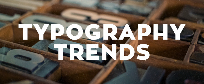
Typography Trends for 2016
RETRO GRUNGE TYPOGRAPHY

source: Diet Coke

source: OCJ Apparel
There's no doubt about it, retro and vintage are having a moment. From start-ups to Fortune 500 companies, designers are using old style, grungy yet elaborate, type options. The best ones are usually custom, single use designs that don't have a lot of extra characters or styles. The key is moderation. Use on a word or two (or logotype) as your main display to let it shine. Then use a clean supporting type for body copy, etc.
SCRIPTS/WATERCOLOR TYPOGRAPHY

source: Plated

source: freeland typeface
Fun-loving and light-hearted. When you want to emphasize a down-to-earth, personal approach behind a brand or service using scripts/watercolors typography does just that. Their familiarity and natural feel allow them to escape the coldness, technical impression of the digital environment and achieve a more humanized look. This style can easily come across as feminine but designers are stepping up to the challenge and finding it worthwhile. Similar to retro grunge, this style should have a singular and specific purpose in the design.
ALL CAPS EVERYTHING TYPOGRAPHY

source: The Conservation Center

source: webneel
All caps has come a long way from just shouting at the reader. This trend, more than any other, we've seen make it's way to our corporate clients. Setting a clean sans serif typeface in all caps and using varying weights in a font family makes for a big impact while keeping things consistent. Thin, condensed and even wider typefaces can all work effectively in all caps. Making sure to leave plenty of space around lettering, simple and easy to read words and phrases make for great display purposes. The contrast in clean space and all caps lettering can be stunning. All caps can pair particularly well, as is the trend, with hero-sized imagery to create an engaging dominant visual.
TRENDING TYPOGRAPHY USE: SUPERIMPOSED OVER IMAGES

source: Paul Rand

source: Tyler Flemming Design
We're seeing it everywhere! The days when images and text were two separate entities are over. Today, superimposing text over images can make both more powerful. The key is to consider contrast and legibility. A striking image with gorgeous type, it's a beautiful thing.