
I'M HERE...So excited to take part at this event. What will the field give us tomorrow, after 36 holes today?
OH WAIT...we do!

Typography at it's most basic state is the art and technique of arranging type to make written language legible, readable, and appealing when displayed. Each year brings new innovations as well as the rebirth of old techniques. With thousands of different fonts and type styles available, companies work to find a font that represents their brand goals and culture. We often see companies taking on large re-brand projects in an effort to stay current and relevant. Whether it's a massive rebrand or a light refresh, typography always plays a leading role in identifying the brand.
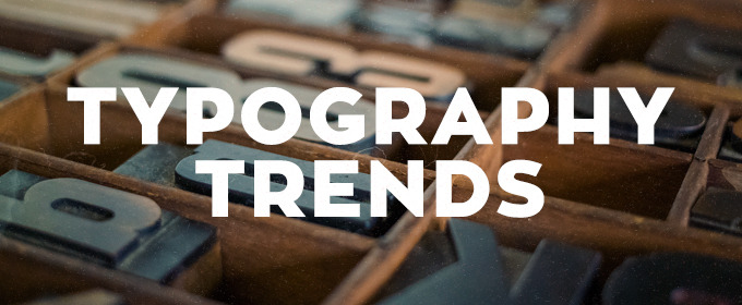
Typography Trends for 2016
RETRO GRUNGE TYPOGRAPHY

source: Diet Coke

source: OCJ Apparel
There's no doubt about it, retro and vintage are having a moment. From start-ups to Fortune 500 companies, designers are using old style, grungy yet elaborate, type options. The best ones are usually custom, single use designs that don't have a lot of extra characters or styles. The key is moderation. Use on a word or two (or logotype) as your main display to let it shine. Then use a clean supporting type for body copy, etc.
SCRIPTS/WATERCOLOR TYPOGRAPHY

source: Plated

source: freeland typeface
Fun-loving and light-hearted. When you want to emphasize a down-to-earth, personal approach behind a brand or service using scripts/watercolors typography does just that. Their familiarity and natural feel allow them to escape the coldness, technical impression of the digital environment and achieve a more humanized look. This style can easily come across as feminine but designers are stepping up to the challenge and finding it worthwhile. Similar to retro grunge, this style should have a singular and specific purpose in the design.
ALL CAPS EVERYTHING TYPOGRAPHY

source: The Conservation Center

source: webneel
All caps has come a long way from just shouting at the reader. This trend, more than any other, we've seen make it's way to our corporate clients. Setting a clean sans serif typeface in all caps and using varying weights in a font family makes for a big impact while keeping things consistent. Thin, condensed and even wider typefaces can all work effectively in all caps. Making sure to leave plenty of space around lettering, simple and easy to read words and phrases make for great display purposes. The contrast in clean space and all caps lettering can be stunning. All caps can pair particularly well, as is the trend, with hero-sized imagery to create an engaging dominant visual.
TRENDING TYPOGRAPHY USE: SUPERIMPOSED OVER IMAGES

source: Paul Rand

source: Tyler Flemming Design
We're seeing it everywhere! The days when images and text were two separate entities are over. Today, superimposing text over images can make both more powerful. The key is to consider contrast and legibility. A striking image with gorgeous type, it's a beautiful thing.
Drinkware is super personal and with so many options these days, you're left asking, "Which one do I commit to?" Does the aesthetic value trump feature/function for you? Are your opinions heavily swayed because of brand? Does it keep your favorite beverage hot or cold for that perfect amount of time? Do you consume 8 oz. by lunch, or do you require 54 oz. before your first coffee break? If you're as lucky as Goldilocks, you can find the piece of drinkware that's "just right" and captures the right amount of gravitas.
What's your drinkware personality?
#PPWWeek

Thanks Burns & McDonnell for including Grapevine Designs this morning, such an honor to be a valued partner. We appreciate your development of small, minority, and women-owned business and recognizing outstanding partnerships. Congratulations on the grand opening of the world headquarters expansion, your identity is celebrated beyond our Kansas City community.
Click here to take a peek into Burns & McDonnell's headquarters expansion.

Stay tuned for a backstage pass to the open.
In the meantime, test your U.S. Open IQ: Click Here
May is Bike To Work Month
PROMOTE HEALTH, WELLNESS AND
SUSTAINABILITY IN YOUR OFFICE

May is a magical time. Spring is in full swing, sunny skies mean more fun and outdoor activities. That's why cities, countries and companies all over the country celebrate the change in the weather with National Bike to Work Month!
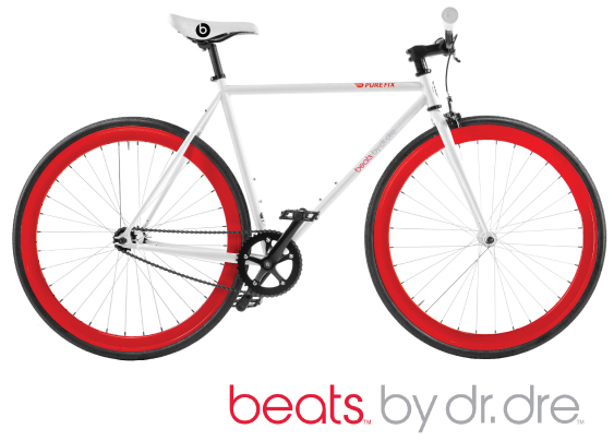
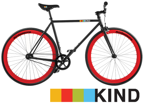
Get involved with a custom branded bike to match your style. Great for Retail Display, Events & Product Launches, Giveaways, Tradeshows, Corporate Gifts, or Office & Campus Bikes.
It's Time to Gear Up for T-Shirt Season


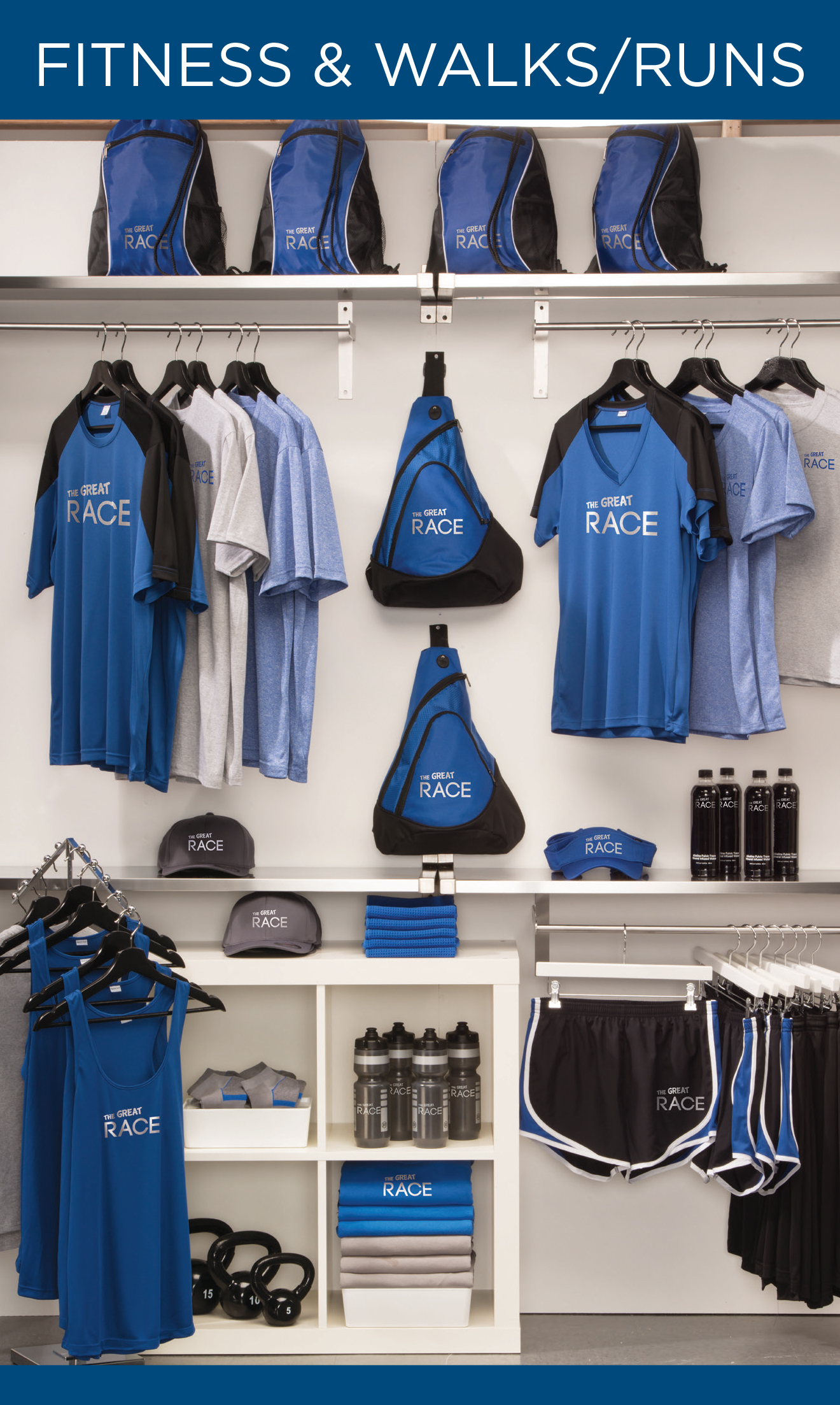

If you thought t-shirts were a thing of the past, you thought wrong. From soft, tri-blend concert t's to dry wicking race t's, the t-shirt is still in great demand. As summer approaches it means people will be taking vacations as well as attending festivals, concerts, camps and participating in sports leagues. All of these activities call for great accessories and shirts that they will wear beyond the summer. Even restaurants and bars, with their trendy logos and creative merchandising displays, have found great success in t-shirt sales.
The modern t-shirt has a plethora of options, from style to fabric, color and more. Plus with the expansion of printing capabilities you are now able to truly customize the look and feel of your t-shirt. These distinct options allow for your brand to last over time.
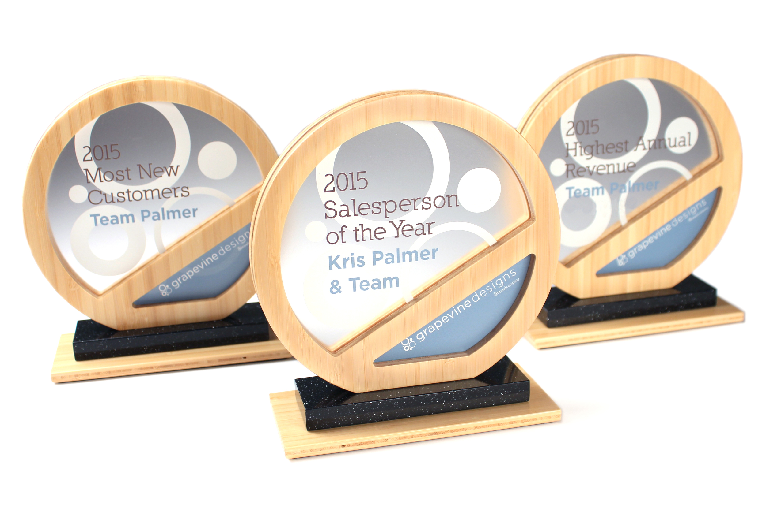
We're feeling so thankful today. It's such an honor to work with clients that allow us to do what makes our hearts sing. We're super fortunate, and take nothing for granted.
Cheers to Team Palmer!
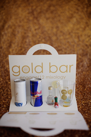
One of our favorite organizations, BizBash shares super cool giveaways and event merch from their Engage! 12 Summit.
When building a program, we always like to consider the attendee perspective. What will impress them? What will make them more comfortable while in attendance? What takeaways or action items would you like them to have? How can you extend the experience, so they will continue to come back year after year?

Registration Desk
(Displayed items that were in the welcome totes.)
Turn down gift idea.
(Minibar Kit)
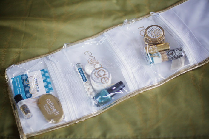
Meeting survival kit.
(Each day had its own pouch of items.)
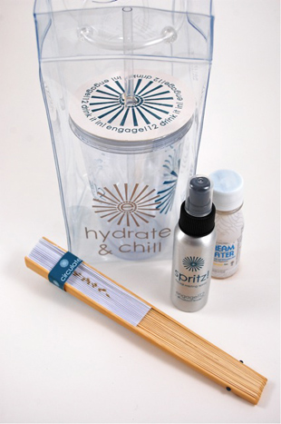
Poolside gift package.
(Fan, water mister, bottle of sleep-inducing Dream Water and insulated cup.)

Meeting necessities
(Pencils, sticky notes, a journal, mints and candy, and “Thinking Putty," a Silly Putty-like product to keep guests’ hands engaged.)
See more here: BizBash