Did we mention that we love what we do?
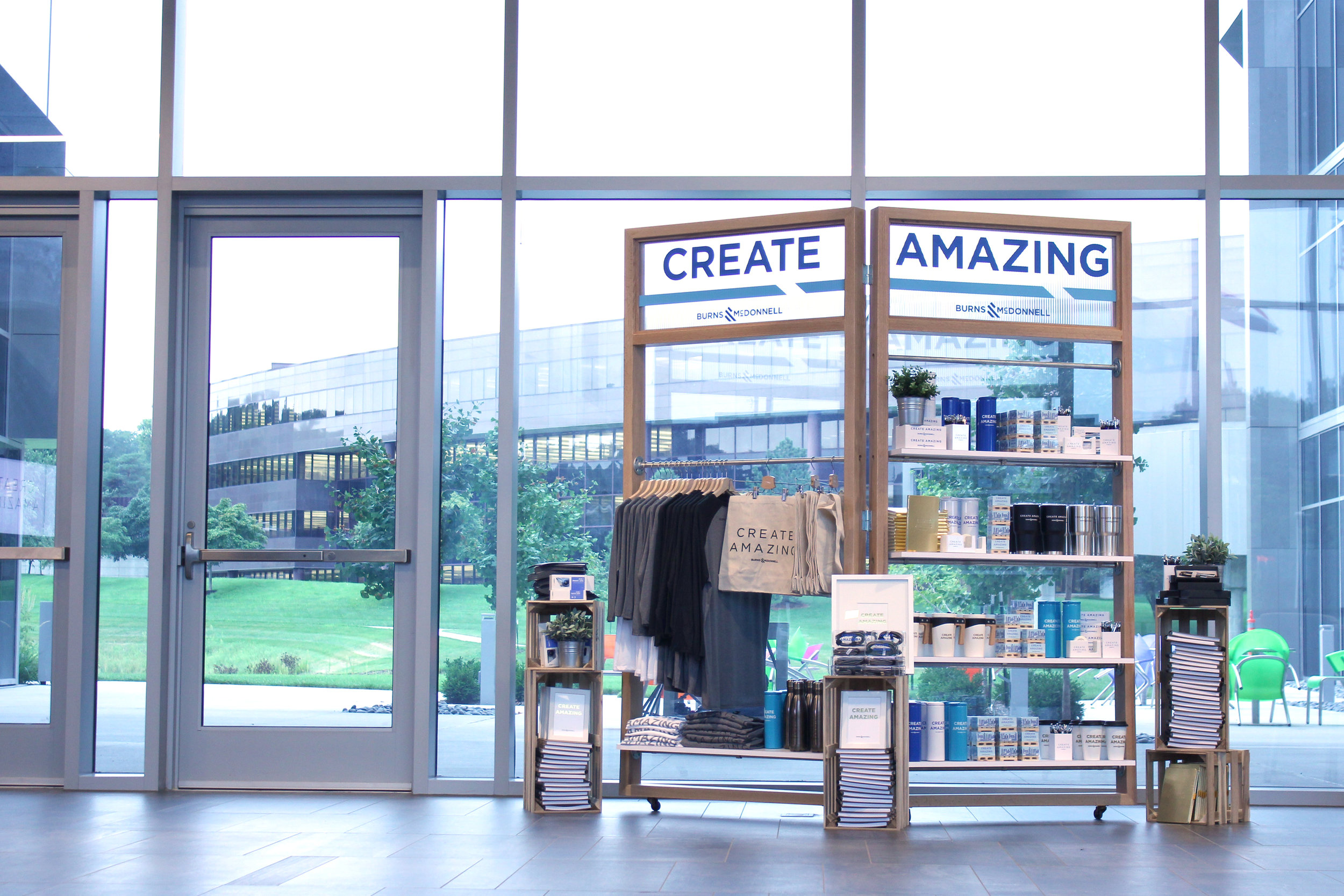
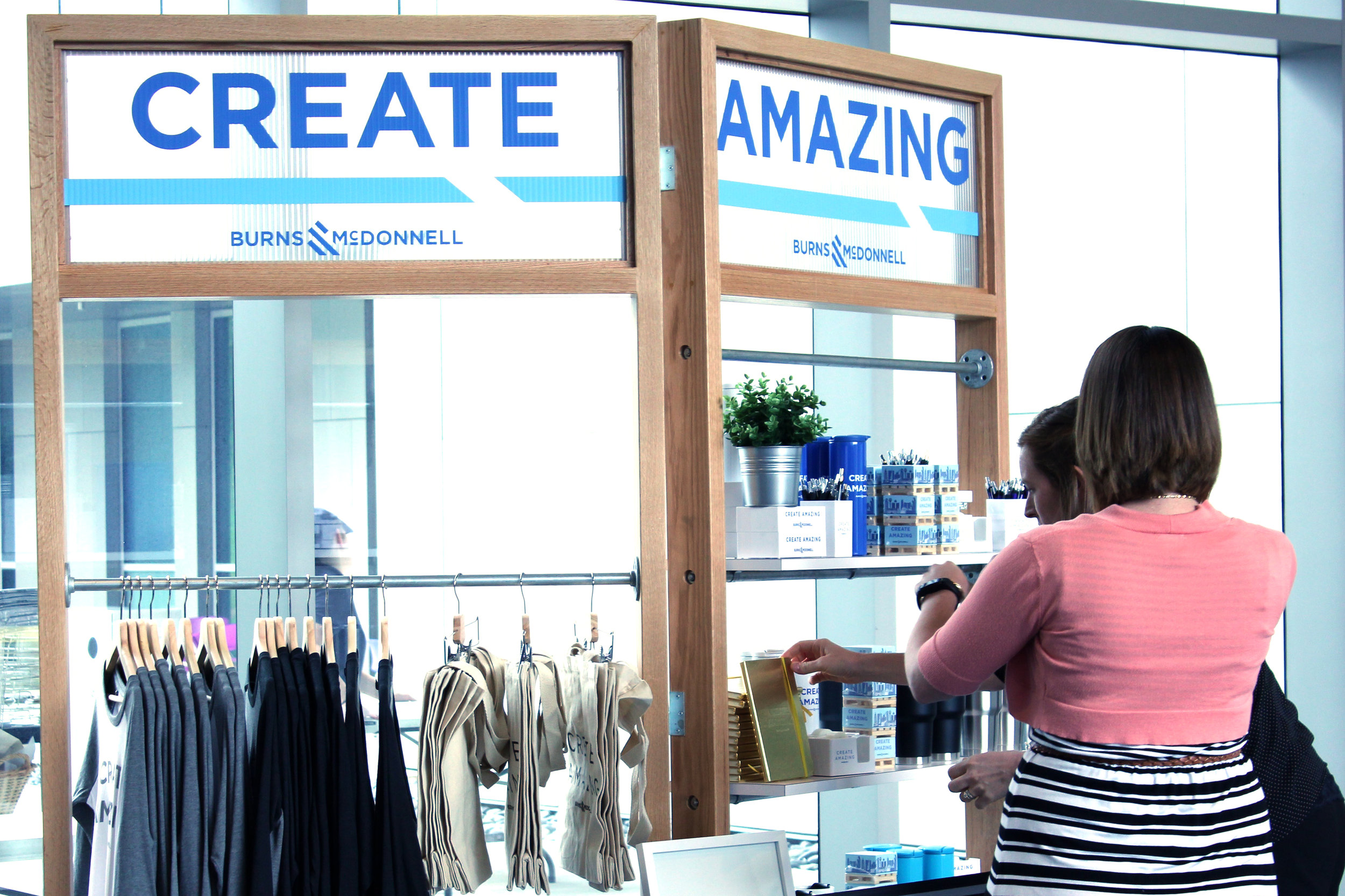
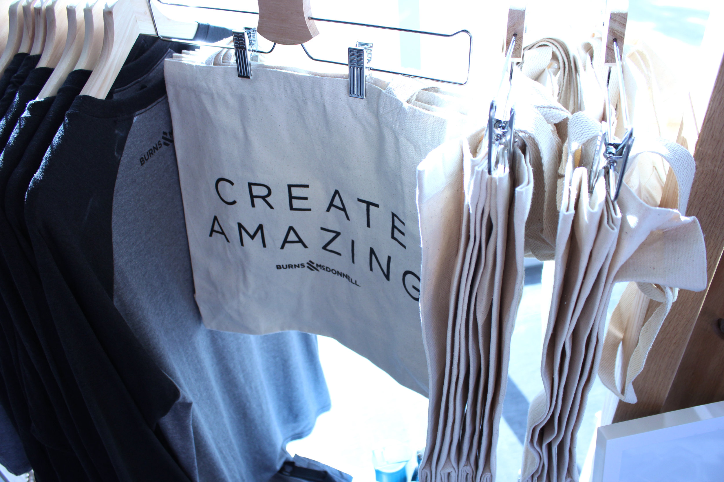
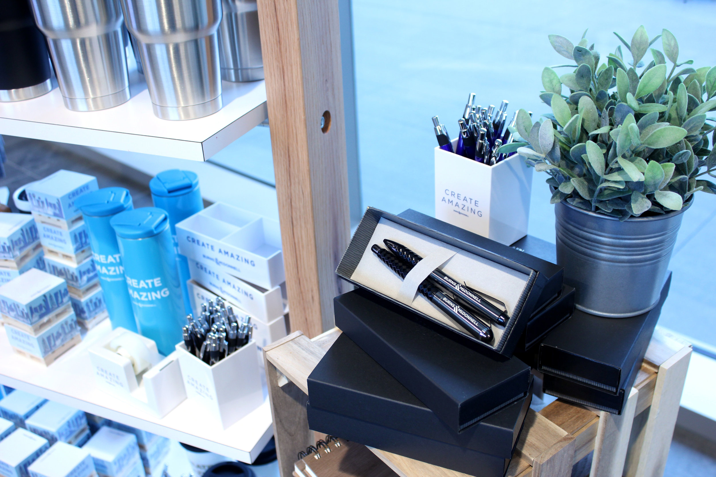
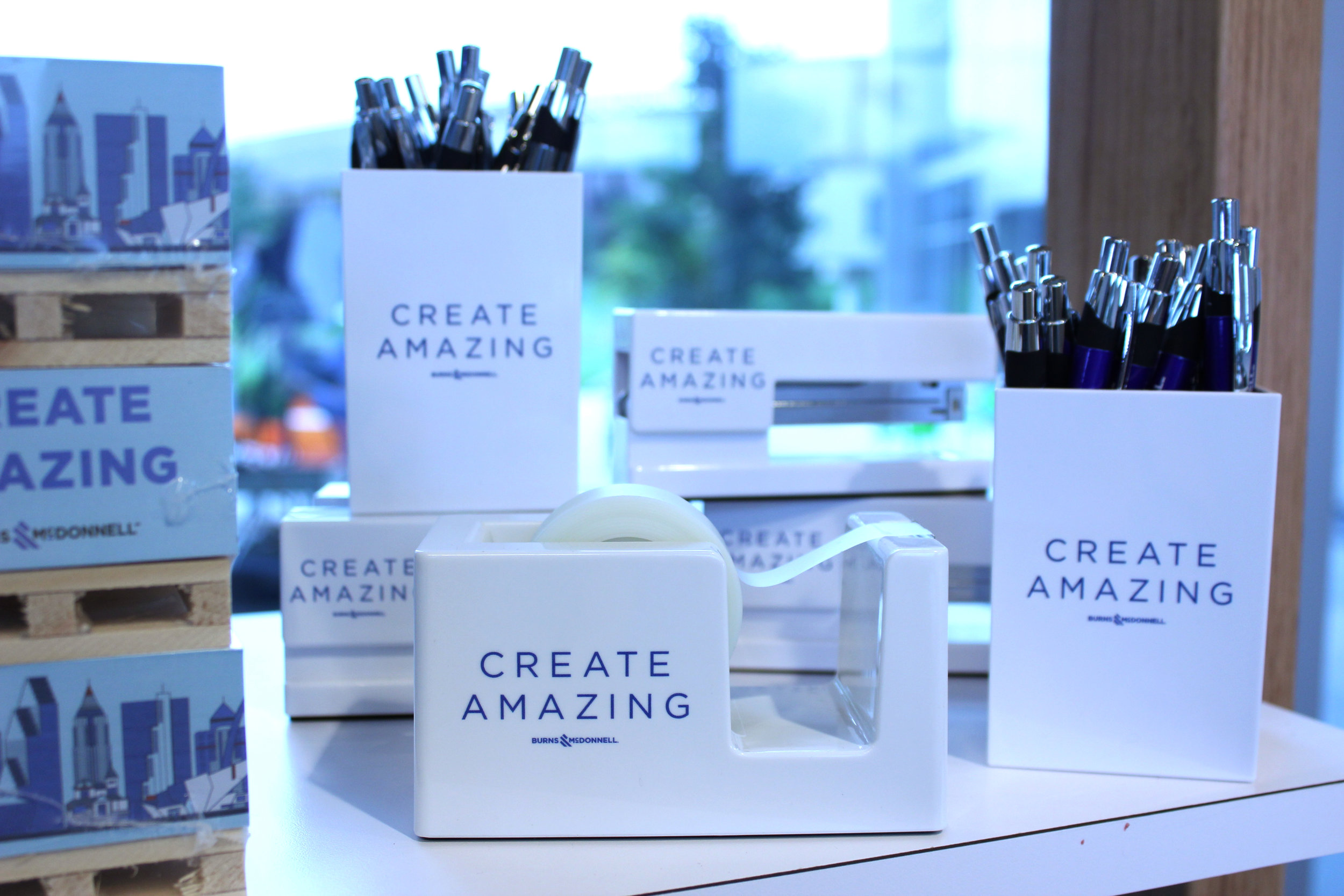
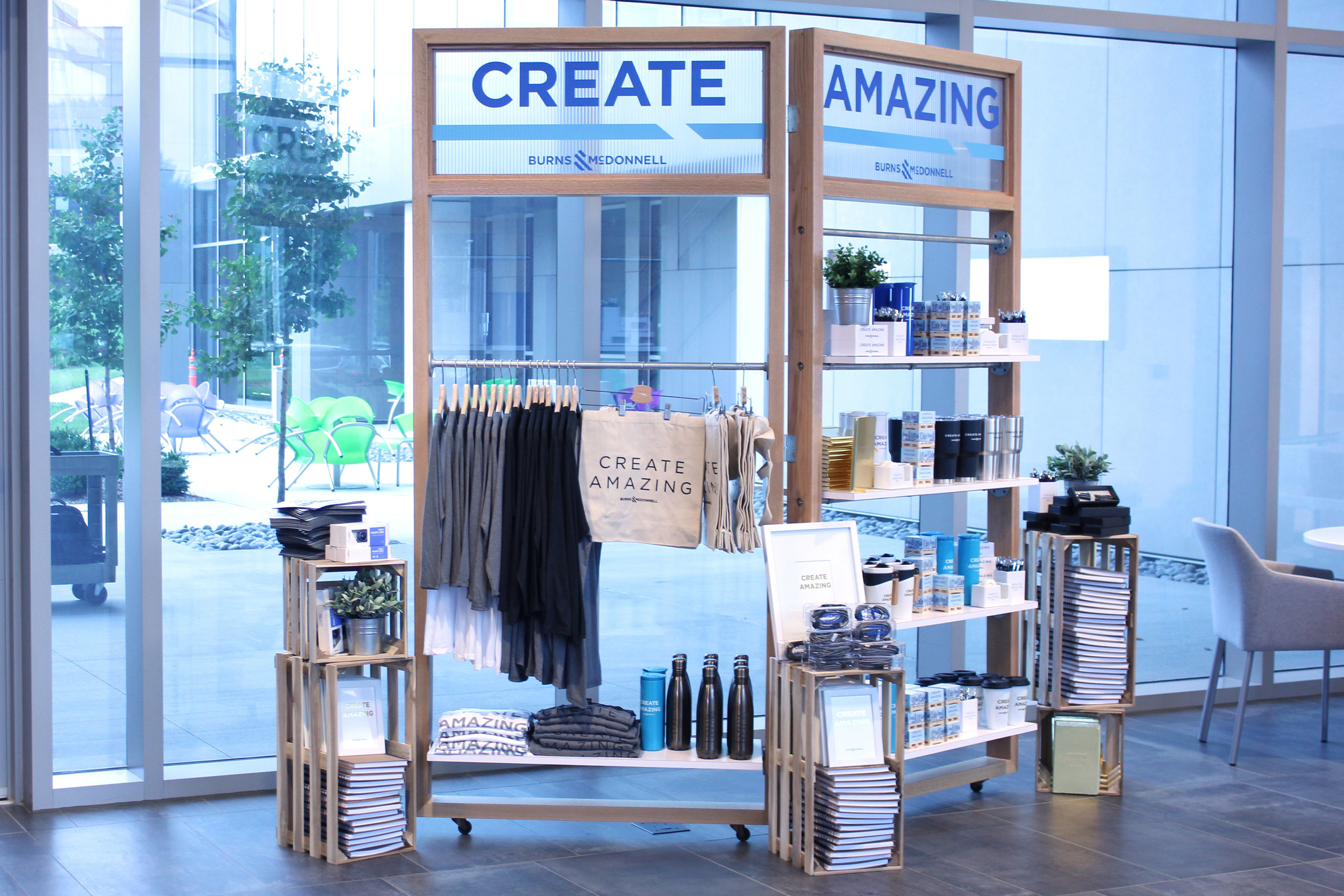
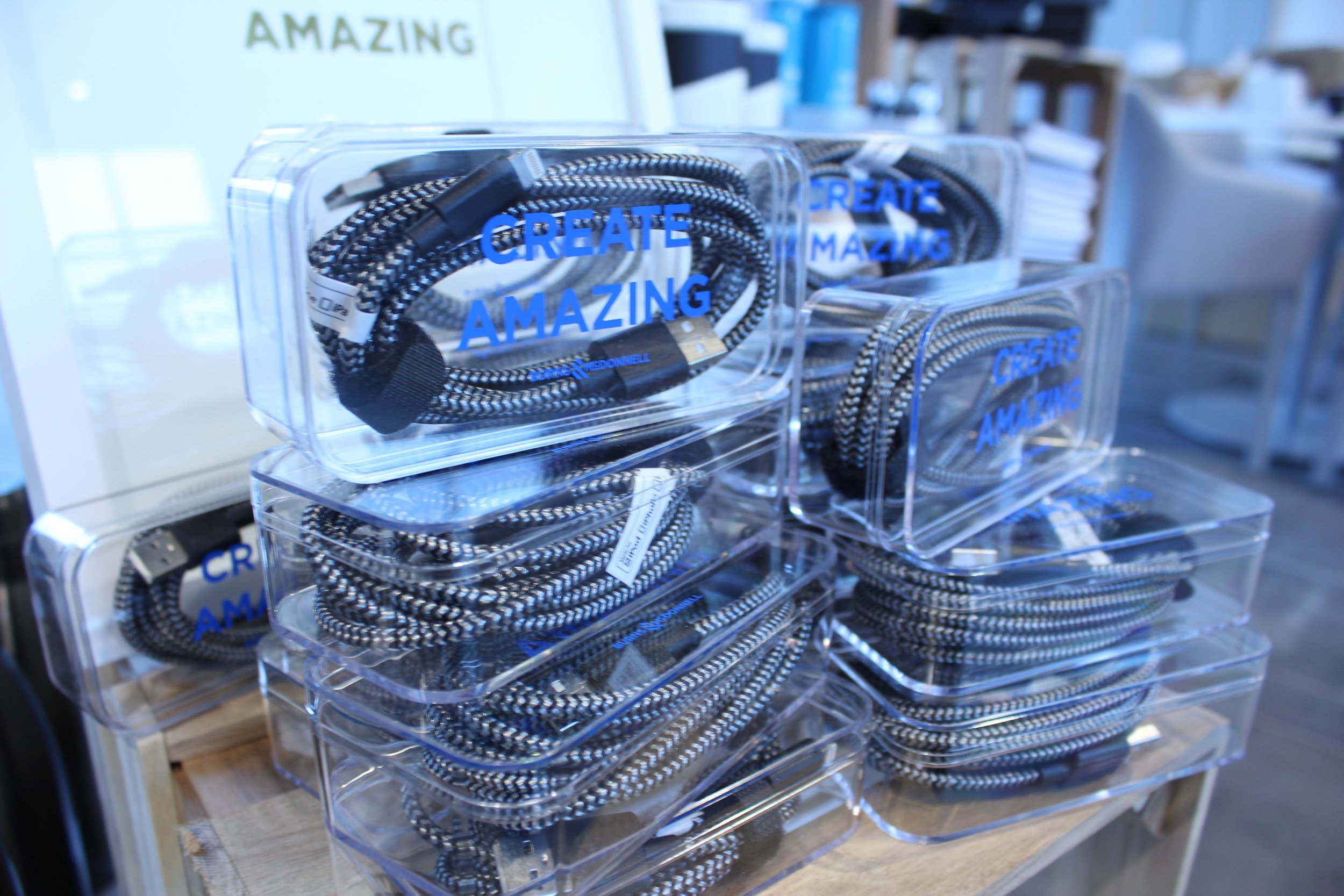
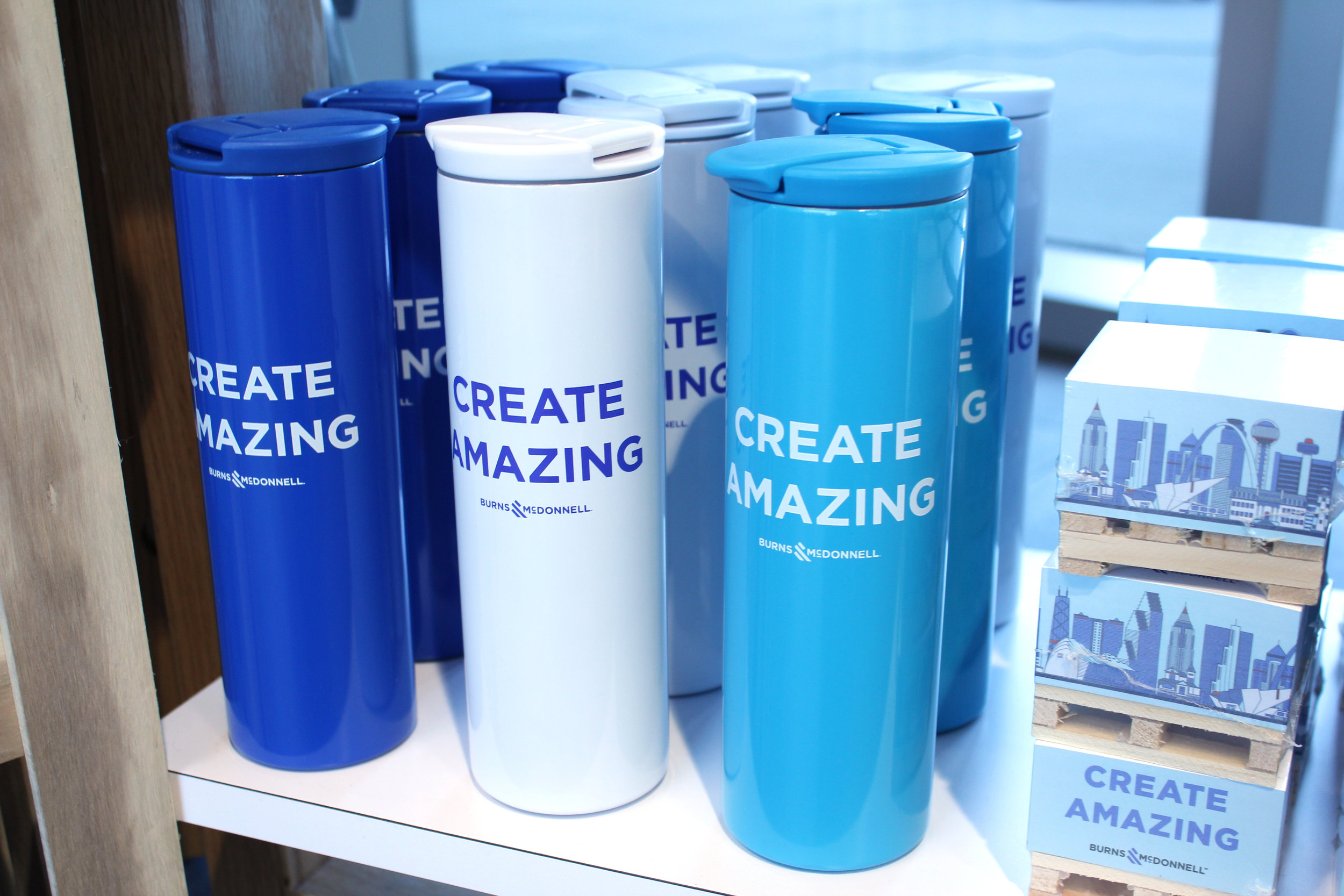
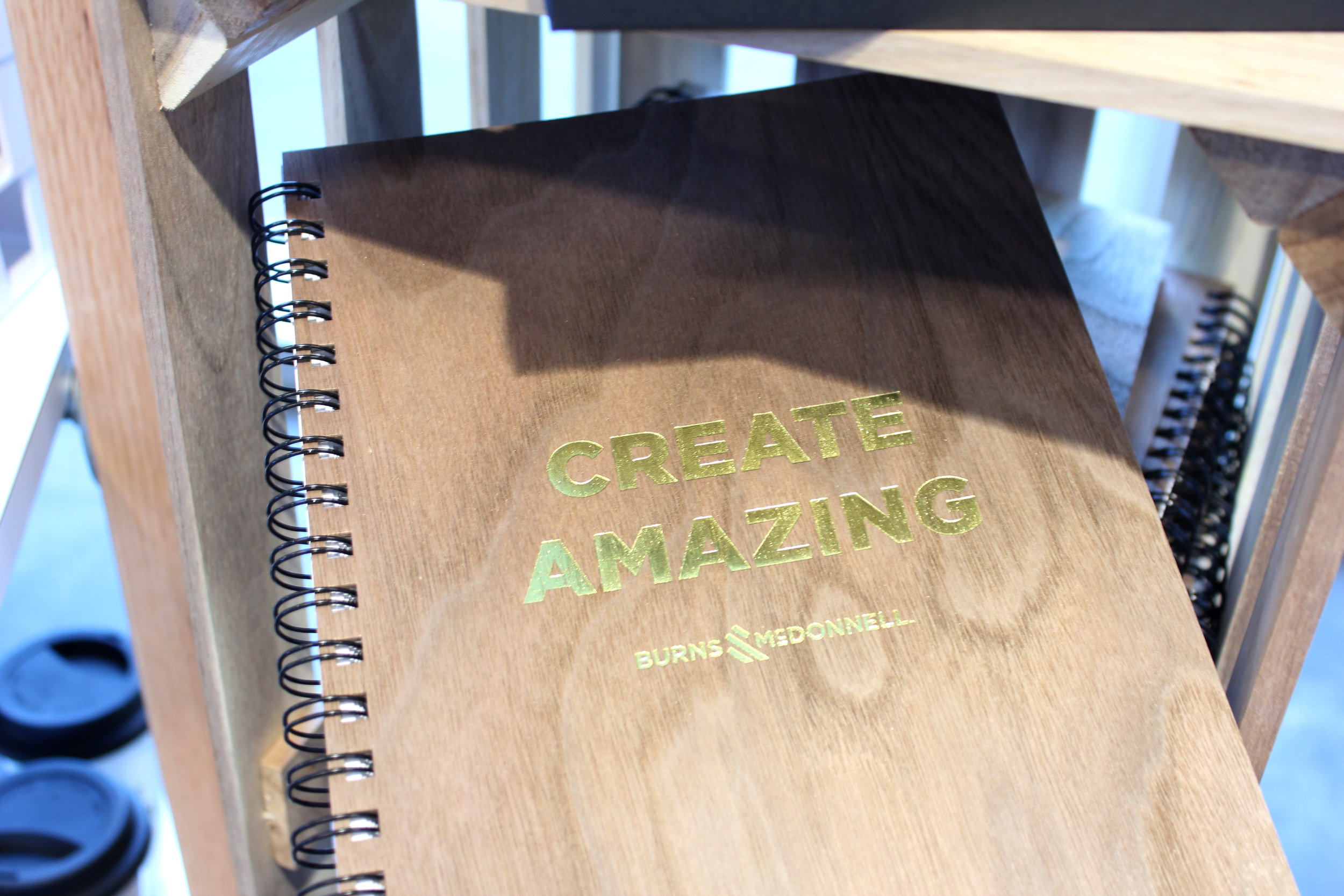
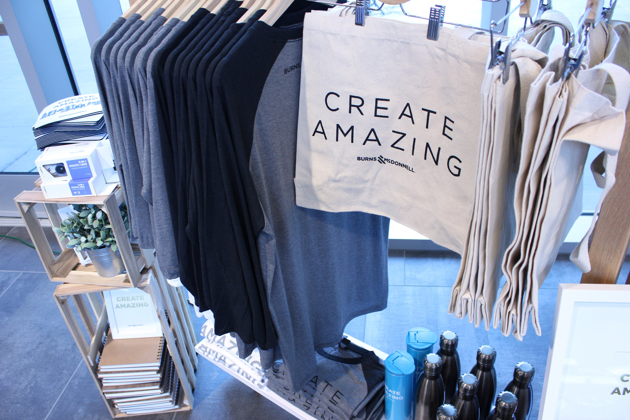
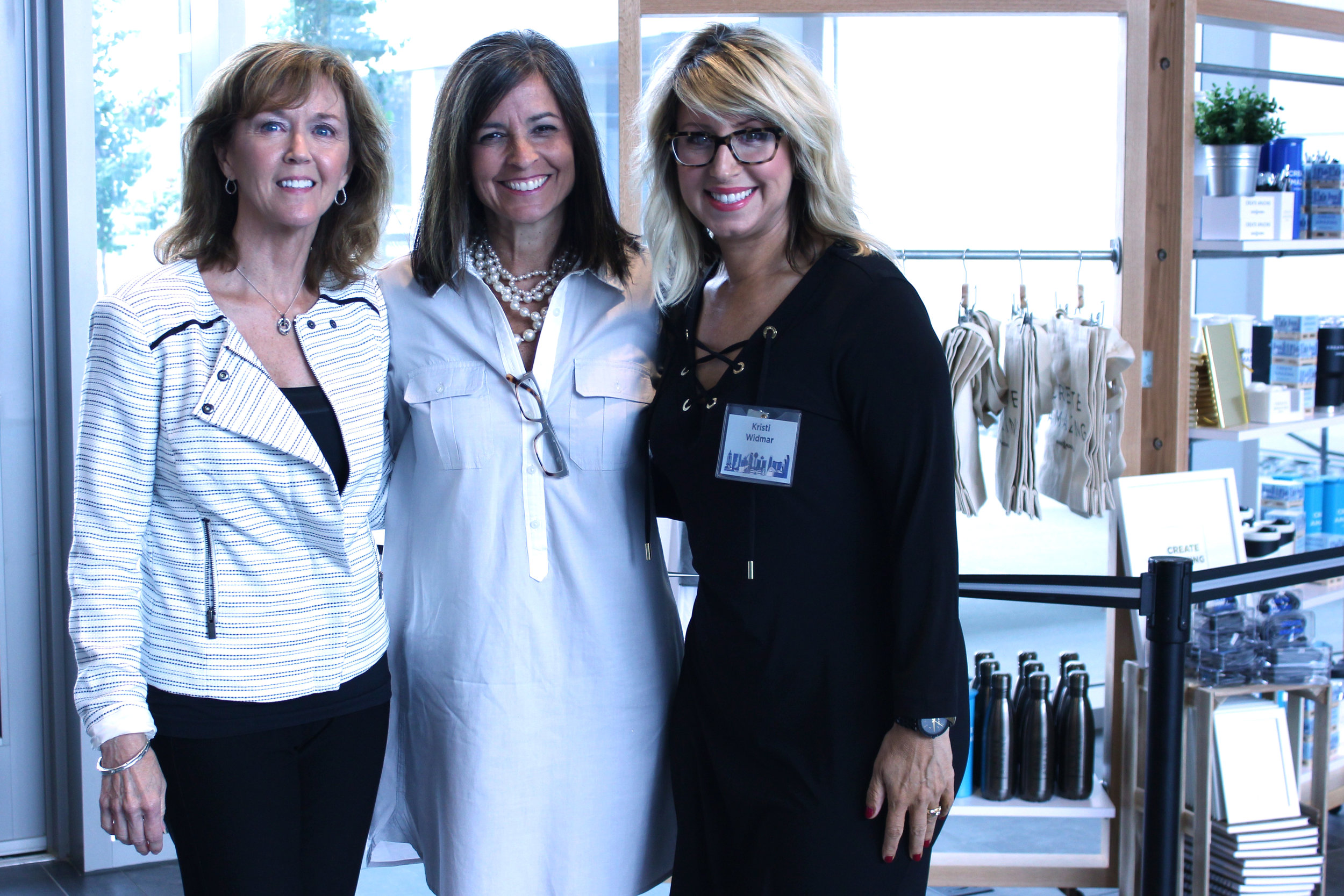
Enjoyed being a part of this Marketing Conference and putting together an exclusive PopUp Shop just for this event. Creating Amazing with an awesome brand!


We've perfected the art of finding needles in haystacks.
Digging the juxtaposition of hard edges of wood combined with the beauty of glass, mirrors and gold accents. We're seeing it on the shelves of our favorite retailers as well as in the decor of corporate events. Pairing high sheen with rough hewn, luxe with recycled and re-purposed, traditional with contemporary. Opposites really do attract.

RETAIL & EVENT INSPIRATION
People are accepting that contrasting design elements can work together, even if tradition or custom has taught them differently. It's like mixing your favorite blue jeans with a dress top. It just works.
The corporate market offers an array of products that help your brand stay on trend.

CONTACT US FOR ANY PRODUCT SPECIFIC INFORMATION.

In todays world, where no one is far from their smart phone, Mobile Tech is King! We are always on the hunt for something new and innovative to help set our clients apart and we found it in this 2-in-1 Photo Lens. It's the newest tech accessory and we are a fan!
The Portrait lens is a great mobile tech gift for all audiences, and gives your logo unlimited impressions anytime a photo or video is taken. This 2-in-1 Portrait snap on lens features high quality wide angle (0.36x) and macro (15x) lenses, shiny metallic polish finish, and large imprint areas to showcase your company logo and message.
Imagine a crowd of people holding up their phones, taking pictures at any event with your logo in plane view.

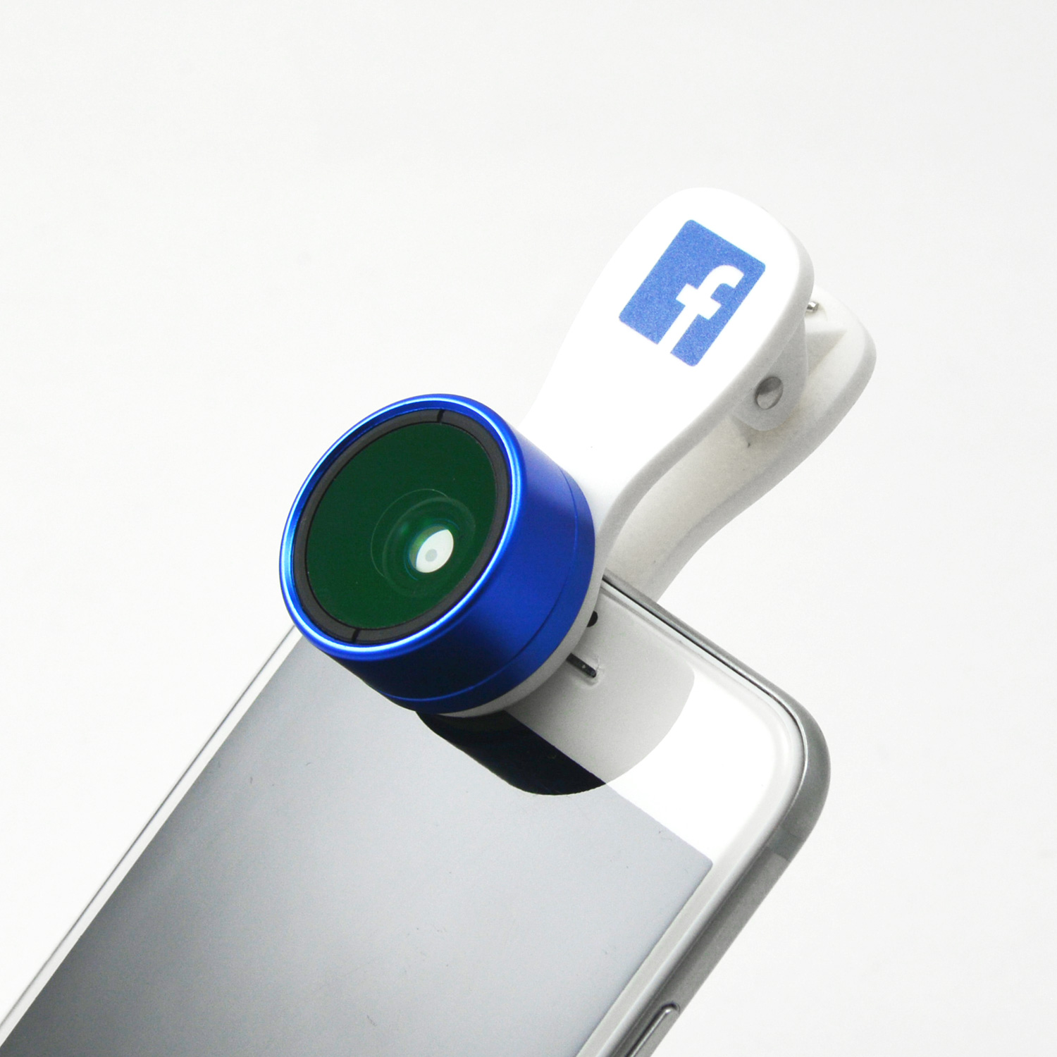


Each individually packed in retail gift box and includes carrying pouch and lens protectors.

Available in 6 different color finishes.

Standard iphone 6 lens

Standard iphone 6 lens

Super Wide Lens (0.36x)

Macro Lens (10x-15x)
We tried it out and here's what we think.
With considerable imprint space for your company logo and message we think this 2-in-1 Photo Lens makes for a great tech gift that people will hold onto and use, giving your brand unlimited impressions.
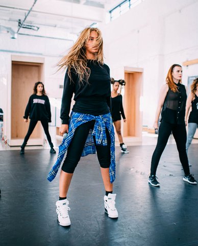
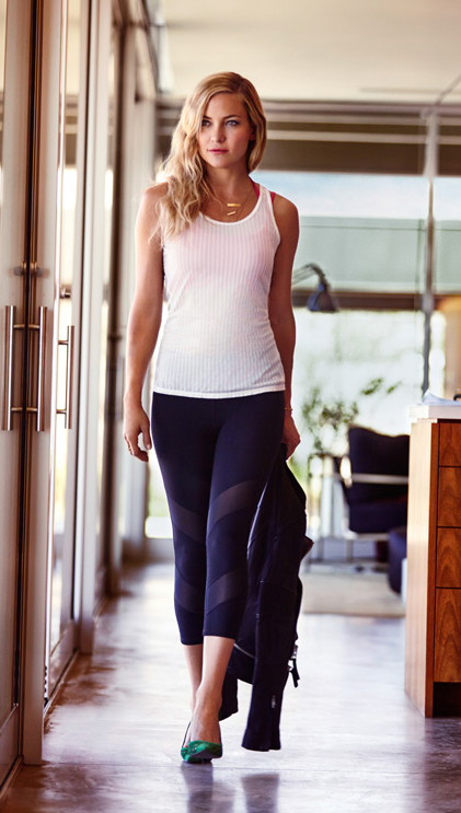
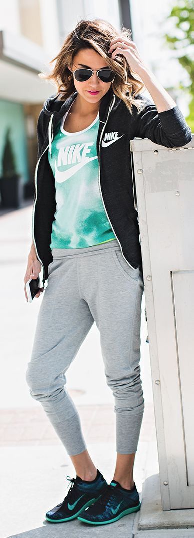
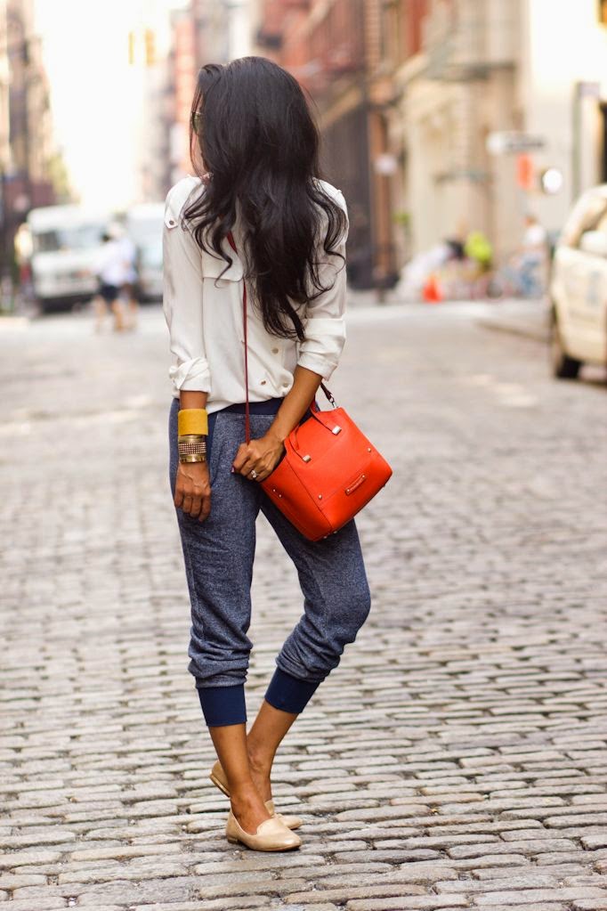
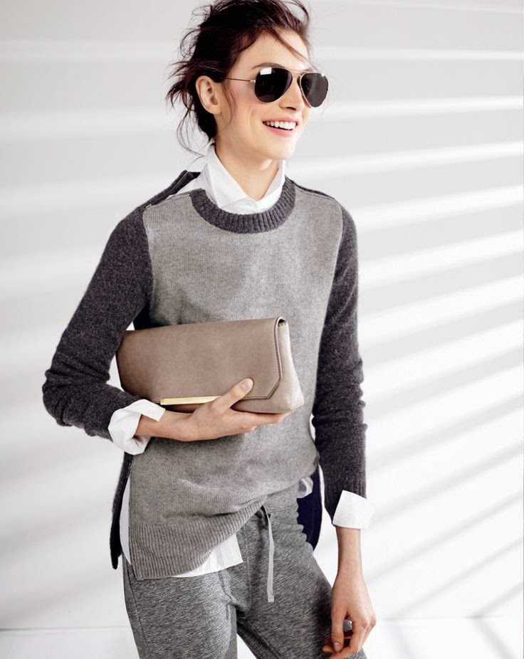
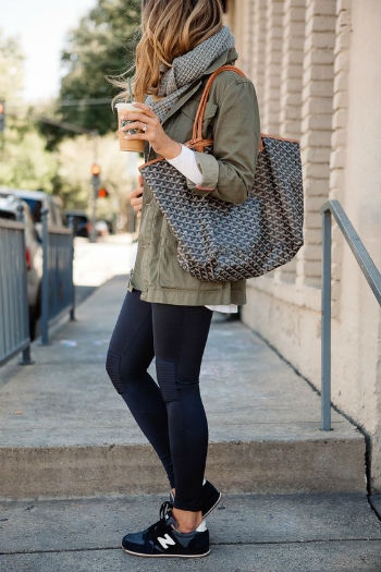
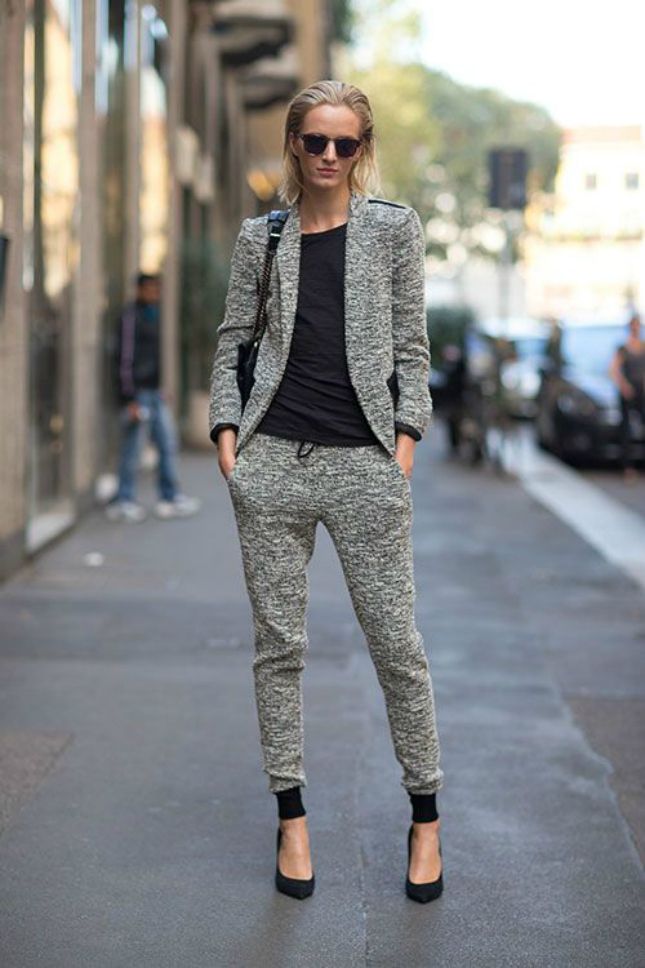
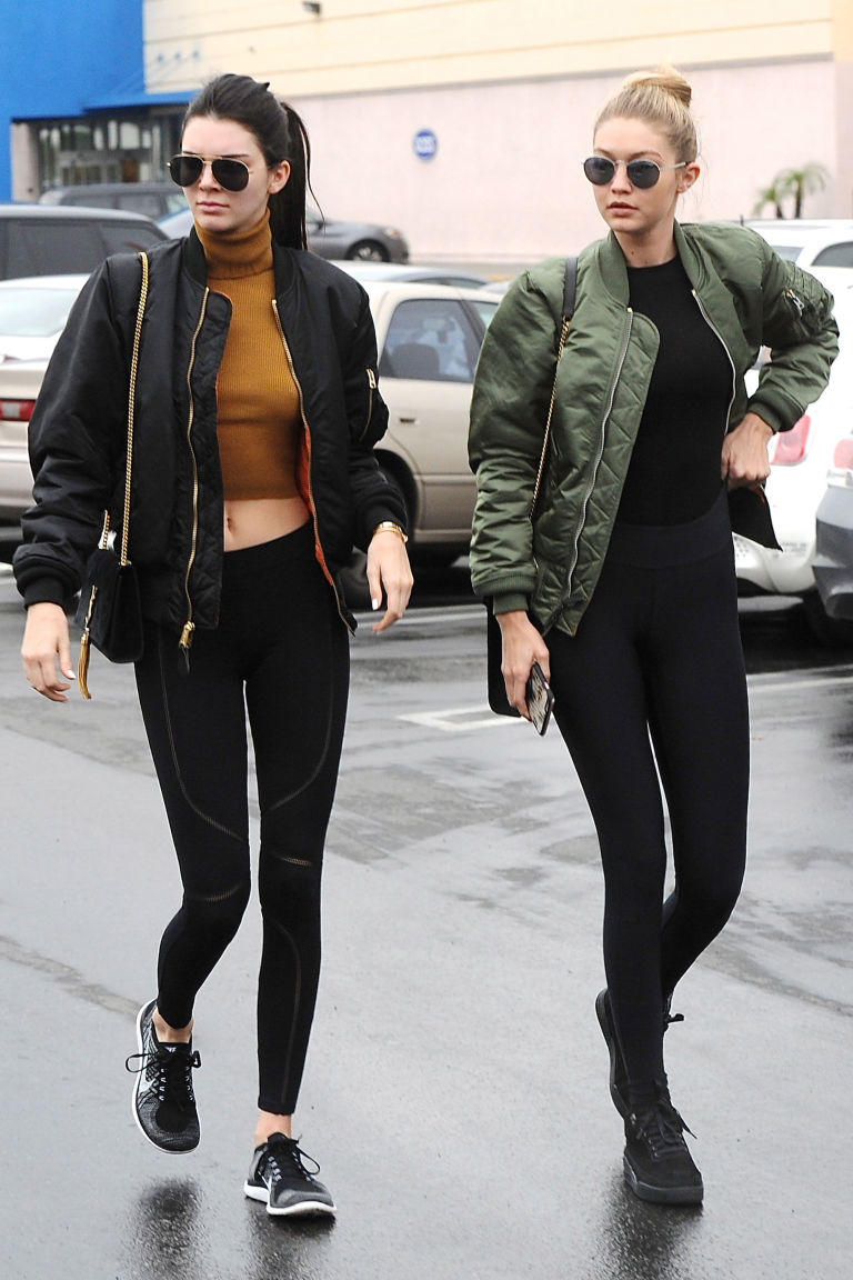
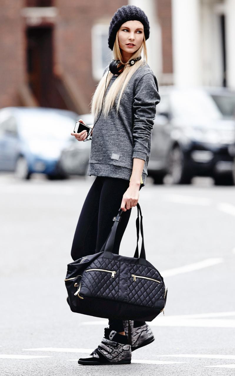
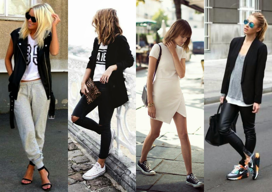
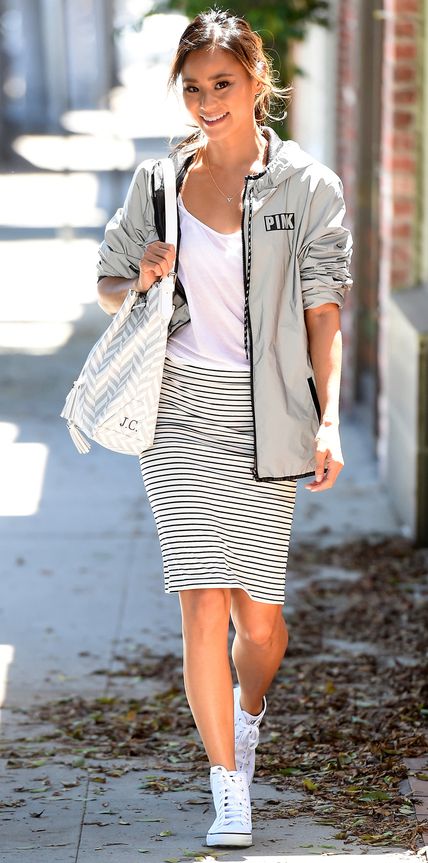
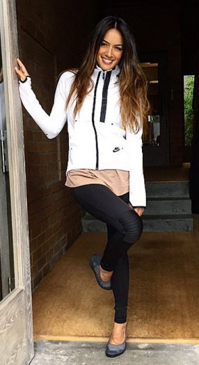
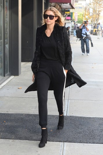
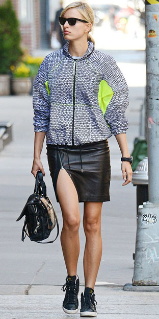
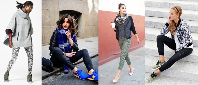
You may not have known it had a name but you've definitely seen this rising trend. Athleisure has come a long way from just women wearing yoga pants outside of the gym. Now CEOs are wearing sneakers to board meetings and tri-blend sport tees under their blazer. Corporate America isn't as 'buttoned-up' as it once was, partly due to the rise of fitness-conscious consumers who look at athletics not only as a hobby but also as an all-around lifestyle. For those that never go near a gym but who are enjoying athleisure, this trend meets consumers' desire for clothing to be comfortable, while still being functional in a professional environment.

image source: birchbox
Numbers are proving this is no passing fad but a real industry game-changer. "Casual and 'athleisure' have taken on a life of their own," said Marshal Cohen, chief industry analyst, The NPD Group, Inc. "This is no longer a trend, it is now a lifestyle that is too comfortable, for consumers of all ages, for it to go away anytime soon." As the trend grows, well-known athletic brands are taking notice. Many companies are introducing an athleisure section in addition to their bread and butter fitness collections, positioning themselves outside the gym. We are seeing brands that used to align exclusively with team sports now coming into the corporate market.
There is no doubt athleisure has blurred the line between casual and corporate, causing businesses to update their dress code. With these changes we continue to see a new selection of products for events and promotions. Gone are the days of the standard long sleeved button up. Now our clients are demanding durable, lightweight, breathable poly fabrics for comfort and all-day performance.
We don't see this trend leaving any time soon. It's more than a fad, it's a complete lifestyle shift and we're keeping our finger on the pulse to keep our clients current.
We're split on this one so we want to know your thoughts.
Heather is a Yay and Kris is a Nay.
Leave a comment with your vote of Yay or Nay.
Here is an exert from a great speech from Spielberg's where he talks about listening to the "whisper."
“Sometimes a dream almost whispers. And I’ve always said to my kids, the hardest thing to listen to—your instincts, your human personal intuition—always whispers; it never shouts. Very hard to hear. So you have to every day of your lives be ready to hear what whispers in your ear; it very rarely shouts. And if you can listen to the whisper, and if it tickles your heart, and it’s something you think you want to do for the rest of your life, then that is going to be what you do for the rest of your life, and we will benefit from everything you do.”
I'M HERE...So excited to take part at this event. What will the field give us tomorrow, after 36 holes today?
OH WAIT...we do!

Typography at it's most basic state is the art and technique of arranging type to make written language legible, readable, and appealing when displayed. Each year brings new innovations as well as the rebirth of old techniques. With thousands of different fonts and type styles available, companies work to find a font that represents their brand goals and culture. We often see companies taking on large re-brand projects in an effort to stay current and relevant. Whether it's a massive rebrand or a light refresh, typography always plays a leading role in identifying the brand.

source: Diet Coke

source: OCJ Apparel
There's no doubt about it, retro and vintage are having a moment. From start-ups to Fortune 500 companies, designers are using old style, grungy yet elaborate, type options. The best ones are usually custom, single use designs that don't have a lot of extra characters or styles. The key is moderation. Use on a word or two (or logotype) as your main display to let it shine. Then use a clean supporting type for body copy, etc.

source: Plated

source: freeland typeface
Fun-loving and light-hearted. When you want to emphasize a down-to-earth, personal approach behind a brand or service using scripts/watercolors typography does just that. Their familiarity and natural feel allow them to escape the coldness, technical impression of the digital environment and achieve a more humanized look. This style can easily come across as feminine but designers are stepping up to the challenge and finding it worthwhile. Similar to retro grunge, this style should have a singular and specific purpose in the design.

source: The Conservation Center

source: webneel
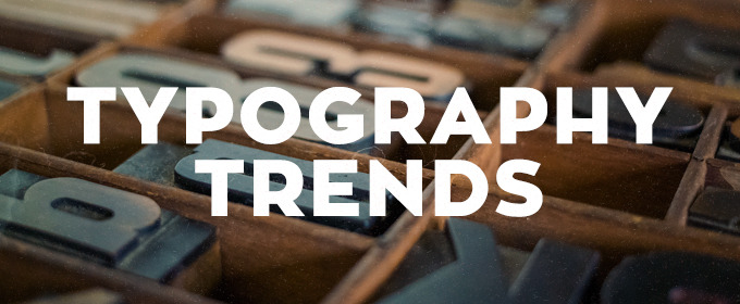
All caps has come a long way from just shouting at the reader. This trend, more than any other, we've seen make it's way to our corporate clients. Setting a clean sans serif typeface in all caps and using varying weights in a font family makes for a big impact while keeping things consistent. Thin, condensed and even wider typefaces can all work effectively in all caps. Making sure to leave plenty of space around lettering, simple and easy to read words and phrases make for great display purposes. The contrast in clean space and all caps lettering can be stunning. All caps can pair particularly well, as is the trend, with hero-sized imagery to create an engaging dominant visual.

source: Paul Rand

source: Tyler Flemming Design
We're seeing it everywhere! The days when images and text were two separate entities are over. Today, superimposing text over images can make both more powerful. The key is to consider contrast and legibility. A striking image with gorgeous type, it's a beautiful thing.
Drinkware is super personal and with so many options these days, you're left asking, "Which one do I commit to?" Does the aesthetic value trump feature/function for you? Are your opinions heavily swayed because of brand? Does it keep your favorite beverage hot or cold for that perfect amount of time? Do you consume 8 oz. by lunch, or do you require 54 oz. before your first coffee break? If you're as lucky as Goldilocks, you can find the piece of drinkware that's "just right" and captures the right amount of gravitas.
What's your drinkware personality?
#PPWWeek

Thanks Burns & McDonnell for including Grapevine Designs this morning, such an honor to be a valued partner. We appreciate your development of small, minority, and women-owned business and recognizing outstanding partnerships. Congratulations on the grand opening of the world headquarters expansion, your identity is celebrated beyond our Kansas City community.
Click here to take a peek into Burns & McDonnell's headquarters expansion.

Stay tuned for a backstage pass to the open.
In the meantime, test your U.S. Open IQ: Click Here